La plus grande cave à bières du monde
Tech notes

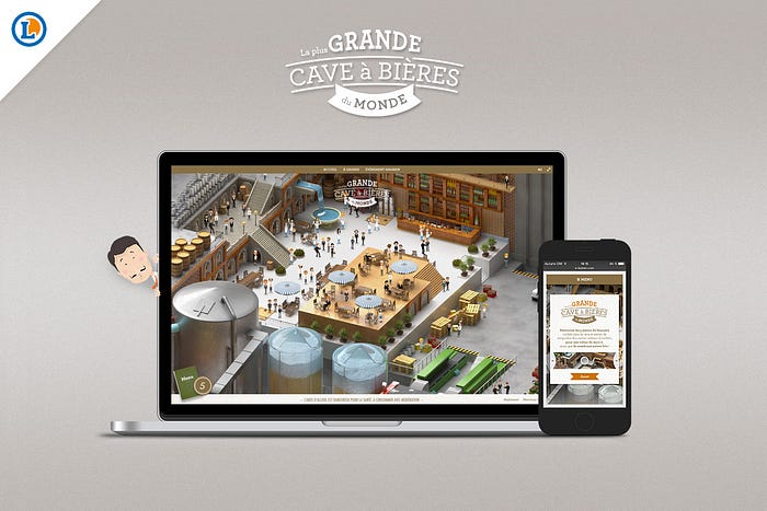
We’ve been asked a lot lately about how we’ve accomplished to build the website La plus GRANDE cave à bières du monde. By the way, if you haven’t seen it yet, we invite you to visit this awards-winning HTML website. It is a “Where’s Waldo?” kind of game, where the user has to search for brewer menus in a gigantic eccentric brewery, in order to win great prizes at E.Leclerc, a famous large retailers brand in France. So, we’re going to try to answer at most of the questions we were asked and we hope you’re going to give us some feedbacks!
Loading optimizations
Files size
Images have been optimized at their maximum. We have a lot of images on this website and we cannot afford too much loading time. So we took care of each image, by trying to get the file size as little as possible, without loosing quality, or at least not too much. We used some tools like grunt-image but also ImageOptim and ImageAlpha. There are no specific settings for all images, we had to make sure the ratio compression /quality was good enough. Also, you shouldn’t look at what you save with only one image, but with all the images together!
Number of requests
Having a lot of files to load is very tiresome for your browser. In fact, your browser will start loading a first batch of 20 files and then, as soon as a file is loaded, it’ll load the next ones. In the meantime, your files are blocked, which means you cannot use them.
So we have minified JS files, CSS files but still we had too many images, meaning too many HTTP requests… Here comes Magipack (it’s a fork) that allows you to generate one file from several images. With this, we reduced the loading time by at least 5 secondes.
Loading strategy
If we load all the assets when you land on the website, you might wait a little bit of time. So we decided to split all the visual assets (static images and image sequence animations) into two packs (with Magipack) : the first pack with all the static images of the UI + first frame of each image sequence (3.2MB) and the other one with the rest of the frames of the image sequences (7.8MB). The second pack’s loading is started once everything else is there. With a decent bandwidth, you should be able to load the second pack in about 7 seconds. You might think it’s long, but because it’s done while everything is loaded, you can watch the beginning of the website with the tutorial, before browsing the brewery, all that within 7 seconds!
Performance
We ran some tests before sticking to one solution. That might seem obvious but sometimes, one solution is better for one browser and not for another. Usually, it’s more like a battle between Google Chrome on desktop vs Safari on iPad.
Map rendering
So we built different map renderers (CSS, Pixi.js, …) to benchmark these renderings on the different browsers. In the end, the Pixi.js map renderer performs better than the others with animations running over.
Animations
We used different types of technics to animate visuals :
- CSS animations — mainly for simple animations and opacity transitions
- JS tweens — for more complex animations (with timelines or so), we mainly used GSAP
- Spritesheet animations — if the animation is not too long and not too big
- Images sequences — if the animation cannot fit in a spritesheet
On this project, we used Pixi.js on desktop/tablet so we created some useful functions to render spritesheets and images sequences into Pixi.js and on smartphone platforms, we used CSS rendering with JS to control them.

Graceful degradation
It’s always nice to have your website working on other browsers than just Google Chrome, but it’s also a pain in the ass sometimes. It’s even harder when the client requests to have a similar experience on tablets and smartphones. At Merci-Michel, we spend a lot of energy to design at best for every browsers but most of the time, we cannot deliver the exact same experience and it’s mostly because of performance.
Tablets
The browser’s resolution is acceptable in landscape comparing to a desktop browser. The problem is once again performance. By removing the animations, we avoid FPS drop and the experience remains good.
Smartphones
The browser’s resolution is too small, so we decided to simplify the navigation into the brewery, by bridling the free moving in the scenery and just have it sliced up into 3 parts. The goal was also to provide a quick and efficient mechanics for mobile users.

Going further
It’s been a pretty challenging project regarding the several optimizations we’ve made. That allowed us to improve our workflow but also to discover new technics and we know what the next steps are. We’ve built better tools and we also discovered new tools built by the community.
We already implemented our own Loader that uses Web Workers. It makes loading in a dedicated thread that won’t interfere on the UI. We’re also using WebP, a new format for Chrome, that better reduces images file size, compared to JPG and PNG.
We hope this article will help you build better websites too! ;)
—
Sincerely Merci-Michel
www.merci-michel.com
Follow @mercimichel on Twitter
Like us on Facebook
